Layout
React Native uses Flexbox as its primary layout system. Flexbox works same way in React Native as it works with CSS in HTML.
In the flexbox layout, the parent container becomes the Flex container, and all its children become Flex items.

Common flexbox attributes
flexDirection
Defines the direction how components are organized inside the container (horizontally or vertically). Unlike web flexbox, the default direction in React Native is vertical.
The flexDirection also defines the primary axis
There are two primary values for flexDirection:
row: This value sets the primary axis to be horizontal. Items are positioned from left to right along the row.column: This value sets the primary axis to be vertical. Items are positioned from top to bottom along the column.

flex
Defines how the space is divided between multiple flex containers or items.
<View style={{flex: 1}}>
  <View style={{flex: 1}}> Some components goes here - 1/3 space </View>
  <View style={{flex: 2}}> Some components goes here - 2/3 space </View>
</View>

alignItems
Defines the alignment of childrens in the secondary axis. If flexDirection is row then the secondary axis is column and vice versa.
Options include: center, flex-start, flex-end, stretch
<View style={{flex: 1, flexDirection: 'row',
  alignItems: 'center'}}>
  <Button title="Button1" onPress={buttonPressed}/>
  <Button title="Button2" onPress={buttonPressed}/>
  <Button title="Button3" onPress={buttonPressed}/>
</View>

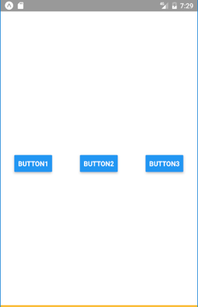
justifyContent
Defines the distribution of childrens in the primary axis.
Options include: center, flex-start, flex-end, space-around, space-between
<View style={{flex: 1, flexDirection: 'row',
  alignItems: 'center', justifyContent: 'space-around'}}>
  <Button title="Button1" onPress={buttonPressed}/>
  <Button title="Button2" onPress={buttonPressed}/>
  <Button title="Button3" onPress={buttonPressed}/>
</View>